Young, creative and innovative
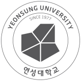
Yeonsung University's Symbol Mark
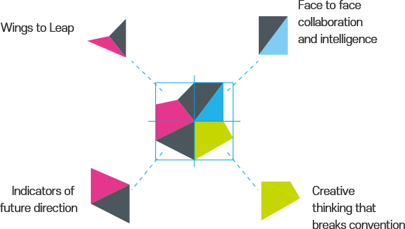
The representative symbol mark of Yeonsung University represents Yeonsung people with infinite possibilities and a bright future.
The shape composed of four quadrants symbolizes wings for leaping, cooperation and intelligence facing each other, creative thinking that breaks conventions, and indicators of the future direction. In contrast, the atypical shape of the symbol implies an active educational philosophy that is constantly evolving and developing.
In addition, the line extending from the center of the square represents the Y of Yeonsung and the person 人, and the colorful spread of colors means a vision for the future (D.Gray) through passion (Magenta), intelligence (Blue) and vitality (Green).
-
 Korean logotype
 -
 Chinese logotype
 -
 English logotype
 -
 Korean and English logotype
 -
 Chinese and English logotype
-
 Korean vertical logotype
 -
 Chinese vertical logotype
-
 Korean logotype
 -
 Chinese logotype
 -
 English logotype
 -
 Korean and English logotype
 -
 Chinese and English logotype
-
Korean logotype
-
Chinese logotype
-
 English logotype
 -
 Korean and English logotype
 -
 Chinese and English logotype
-
 Korean vertical logotype
 -
 Chinese vertical logotype
-
 Black 80%Black 50%Black 45%Black 30%Grayscale - Positive Version
 -
 Black 65%Black 45%Black 40%Black 25%Grayscale - Negative Version (Utilized only on 100% black backgrounds)
-
 Black 100%Grayscale - Positive Version
 -
 Grayscale - Negative Version (Utilized only on 100% black backgrounds)
-
 금색(Gold)
Pantone
873C은색(Silver)
Pantone
873C먹박(Black)백박(White)Grayscale - Positive Version -
 Grayscale - Negative Version (Utilized only on 100% black backgrounds)
-
 Basic full color
 -
 1 Color
 -
 Gold
Gold